Friday, 16 October 2015

There will be BLOOD, lots of Blood!

 Today I've definitely been feeling a bit under the weather.  Not that that is in any way connected to this post but it meant that rather than going in to SIT to work on things today I stayed home. 

So when Callum asked me to mix him up some fake blood for his shoot this weekend I was in just the right place to do it.

I'd got some practice in with fake blood while Art Directing Don's film so I'll be a pro at this soon.

Callum wanted a quite red blood with a bit of depth to it.  He gave me this image as a reference:


This is what I mixed up.  I think this counts as mission successful! 


I combined a couple of different recipes after experimenting on Don's shoot. 

For anyone interested this is the process I use, read on.

For this blood I used:


  • Liquid Laundry detergent (the one I used was a clear blue colour)
  • Red food colouring
  • Blue food colouring
  • Flour
  • Coffee
  • Glucose Syrup 

I don't use measurements although if you want to be able to replicate it exactly wouldn't be a bad idea to make note of what you use.

The laundry detergent makes a good base since it makes things a lot easier to clean up.  It also gives the blood a nice flow from the way the soap kinda drips.  Not so watery.

Obviously if you are dealing with blood in the mouth of actors or certain allergies it's better to use a recipe without the detergent.

I added at least 3 tsp of red colouring to a cup of detergent for my starting point. I had leftover Glucose Syrup so there is about a 1/4 C in the nearly 1 litre of blood that I made today.  This adds a bit of tackiness to the blood.

There's probably about 4 Tbs of flour in this mix.  This is sieved and mixed in which makes the blood more opaque and realistic looking.  It also thickens the blood.


The coffee is used to make the blood darker, as is the blue colouring which also adds some realism. Since the detergent I used has a slight blue to it the blood doesn't need much.  You have to be really careful with blue colouring since it is really strong stuff.  If you put too much in the colour can never be fixed.  I don't even add full drops at a time.  Instead I use a knife or toothpick to get the tiniest amount of blue at a time to add.

I like to mix in parts- split across different containers so that if too much of something is added I don't lose the lot.  This also means I can mix mishaps together in small amounts and sometimes correct the mistakes. 

Knowing how the blood will be used is pretty useful- if it's going to be spread thinly it probably needs more flour to add depth.  If it needs to slowly drip then more syrup and flour is going to help.  You also want it to hold up under the light- so if you know it will be brightly lit it might be worth making the blood darker so it doesn't end up looking orange. 

On a final note- it's worth mixing this up a day or two before.  Since you are mixing detergent it needs sometime for the bubbles to settle down and also to get rid of any lumps from the flour.  

I don't know if I'll ever be needing to make blood again but I feel like I now know I lot about it.

Add it to the knowledge bank!!


Monday, 12 October 2015

Keying and Roto in Nuke

Once I had my edit together I rendered out each sequence as an image sequence (Tiff files) for compositing in Nuke.

My first pass was to key and garbage matte each shot.  I kept this relatively simple to start but found that most of my footage worked better with multiple keys.

I've found Keylight and Ultimatte to give the best results on this particular footage.
 Keylight is picking up hair detail better in many of the shots but giving a dirty alpha, while Ultimatte is nice an clean but also chops off the detail.


Ultimatte Key- See the lack of detail in the hair
Keylight Key- Nice detail but....
... the best Alpha I could get from Keylight without losing detail

The solution? Use them both! I added a key mix to this shot and rotoscoped a basic mask to determine the area each key effected.

Key mix set up
Final Alpha


Working with Problem Shots:

For one shot I plan to composite two shots together.  One actor starts in front of the greenscreen but runs off it so I have a roto job here, while the other actor stays in front of the green screen. Unfortunately the second actor is, once again, out of focus so this shot might take longer than I thought!

In an attempt to cut down on rotoscoping I experimented with the IBK (image based keyer) node.  IBK is made up of two parts- IBK colour and IBK gizmo.  IBK colour is used to generate a cleanplate while IBK gizmo uses the cleanplate and footage to create a key.  I already had a clean plate for this shot so I used my own.

Unfortunately the results weren't great.  The ares where the actor went off the greenscreen did key out but the final key was really messy.  I couldn't think of a way to fix it other than rotoscoping anyway so I decided to scrap this and just get on with the roto!

Another of my shots involves compositing 3 actors into the same shot.  The last part should be simple, all three actors are in front of the green screen and the camera has the same settings and placement; but I knew I would have a roto job on my hands for the first half of the scene.

Unfortunately things are more complicated than I originally thought.  Turns out that the focus on each plate isn't as sharp as it could be- which gives a beautiful green or yellow glow to each actor.

This is also a problem sometimes on motion blur as well so I've found a tutorial that gives a handy node set up for reducing spill.


This has been useful in reducing some of the edge issues and also action shots such as this one:
Original footage

Despill node set up and Rotoscoping in action

Since the action in this shot also goes off the greenscreen a significant amount of rotoscoping was also needed.
A closer look at the Rotoscoping required in this shot


Tuesday, 6 October 2015

The InBetween: Filming!

So, as you know, I have recently been helping out on a couple of other projects.

Unfortunately I tend to get a bit too invested and ended up running out of time to work on my own project.  I would have loved another week to finish up my script, storyboards and get an animatic out but this ended up being impossible.

Despite the lack of planning and last minute availability issues the shoot ended up going mostly smoothly.  There are a few shots I am not completely happy about but for the most part I have some quality footage.  My actors did a great job!

John created a set piece for me which should help out with some of my compositing but I have a huge amount of post production work still to do.

The Ledge, made by the talented John Mellor!
Bring on the Roto!

On a positive note I have a rough edit completed which is approaching picture lock.  I found it beneficial to edit directly to music due to the nature of this project so spent some time finding a suitable track.  I found it impossible to concentrate at SIT in the noisy lab so ended up editing at home instead!

Environment-wise I have heaps to do still but I have some nice bricks!!

Mudbox is great for these kind of textures so I made 3 paint and 3 sculpted variations. I am so pleased to have a decent computer and software at home to be able to do this kind of thing!

Sculpting in Mudbox

Building Pillars


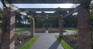
I filmed one of my scenes in the Rose Garden at Queens Park which has these awesome brick columns with vines growing up them.  So to link the different areas of my world I thought bricks were a good way to go.

In the image above you can see I have begun to create vines too!  Things are still a little clean looking at the moment but I'll get to that later! (No spec maps here yet!!)


Rose Garden

Editing... Oh look more bricks :p


Day for Night

Just a tutorial I felt was worth looking at while my scheduling was a mess.  Just in case!!


Art Directing 'Virtual Reality'

Don's film mostly takes place in the main characters room.  I decided that this was the most important place to start when it came to art direction.


For Amanda's room I started out by looking at the mood board I was given by Don. The main elements here are the warm lighting from the table lamps and string lights and the use of images and set decor to enhance the character.

Don's Mood Board

I think when designing a bedroom that the most important consideration is the character and how their personality is reflected in the contents of the room.  Of course you want things to look great- and this is where things like the lamps and lights come in but a bedroom is an opportunity to gain a glimpse into a character.

I spoke with Don about Amanda's character but was told to speak with the actress playing her for more insight into her characterization.  These are the insights I gained from my conversations with both of them and also my own deductions from the script.

Amanda:
  • Architecture Student- creative but technical.  She would have an eye for aesthetics but probably not overly crafty.
  • Interested in martial arts- but from a sporting angle.  Enjoyment of a karate doesn't necessarily translate into a fascination about Chinese culture.  
  • She has some talent as a martial artist, having worn medals- which discipline is never indicated.    
  • Probably procrastinates then works long nights to get things done- her assignment is due the next day and she hasn't started.  Caffeine tablets are a quite extreme measure.
  • Has a close friendship with Tamara but not likely many other close friends.    
  • She doesn't reach out to any of her friends about the hacker.  So she isn't that close to them. Possibly feels the need to be seen as strong and in control.  Independent.
  • Many acquaintances. There are a large number of people at the party.
  • Wears bracelets, rings, nail polish.  Things on her hands and wrists.  Her style is loosely inspired by emo fashion (this has come from the director).
  • I see this taking a more casual effect on her fashion sense due to her sporty nature- emo fashion is often involves lots of co-ordination of outfits and makeup.  Her personality suggests to me that she would be a bit more casual and dress with comfort in mind.  In my previous designs I looked at casual punk fashion.  Casual but a little edgy.
  • Emo and punk fashion is usually connected with music- which might influence her decorating choices.
  • Likes to listen to music while she works   
I wanted to look at ways to show aspects of her character but subtly.  Add too many things to indicate an interest and suddenly your character has an obsession.  Add too many different things to a room and your character is fickle, indecisive, or you are hitting your audience over the head with insights into the character.  This corner shows she likes cats, this wall is because she enjoys music, here's a photo of her at the beach when she was five because she likes swimming... and so on and so forth.   That's just getting way out of hand!

Research:


I managed to source a number of images to use as posters for Amanda's walls.  Here's one I created myself:


I also spent a bit of time bargain hunting and found some great stuff!


A couple of Audio students also came on board to help out and they did a great job providing other things like clothing and toiletries for Amanda's table.

I spent a bit of time experimenting in Photoshop with the layout of the room. 

Since we were going to be filming day-for-night I had the idea to black out the windows using rubbish bags- which worked really well.  After setting up I asked the art department assistants to photograph the area as a reference:


For the party scene I found some vector letters and manipulated them to match the colour scheme that I had decided on.  Some balloons and streamers and our party scene was also sorted.


My initial party scene research
This film also required me to make up a few fake liquids :p Wine and blood both play a prominent role.


Since we would be filming in a borrowed home and pouring fake blood on the floor I mixed up a recipe using laundry detergent, food colouring (red and blue), coffee, glucose syrup and flour.  This obviously makes a non-edible blood but cleans up easier. 

For the wine I mixed up some blackcurrant tea with a touch of colouring and had tonic water on standby for bubbles.  And for beer I went with root beer- which didn't work out quite at well as I had hoped since it didn't foam well.  Since the foam didn't work out it may have been better to go with apple juice for the colour.

Finally Caffeine tablets were panadol with a custom label:


Friday, 11 September 2015

'Suspicions': A short film by Lee Boyd

So last week we wrapped up filming on Lee's film Suspicions, which I was the 1st AD on. 


Leading up to the shoot my first task was to wrangle Lee's four page shot list into something a little more manageable.  We also had to work around the availability of our actors, locations and Vehicles.


The Original Monster Shot List.....


I worked up a schedule then tweaked it until we had something that would work.  I made sure to over-schedule which was lucky since we ended up started about an hour to an hour and a half late every single day of the shoot, but still managed to wrap on time. 

I'm still settling into the on set side of 1st AD'ing even after having the role on the group project.  It would be really valuable to actually see a 1st AD in action :)


Wednesday, 9 September 2015

Internships with SIT Productions

UPDATED: Just to say that the extra hours gained on this Internship will be used towards my personal development hours!

I have some great news!  I've completed my Internship hours!  For my last few hours I Interned with Sit Pro.  Our first task was to help out on Fungi's music video for their single 'My Friend'.


I helped out with Art Department but ended up doing other things like watching gear during the shoot.  My Art department contribution included sourcing a saw, using cardboard to level the phonebox, and finding the correct screws.


There were lot of Interns on this shoot so there wasn't a huge amount to do but we were there as an extra pair of hands in case they were needed.  This shoot emphasized for me that sometimes even if you don't feel that you are doing much small contributions are still valuable and help keep things running smoothly.

This is the final music video.


After this I worked with SIT Pro on a TVC.

Once again I helped out with Art Department and was also an extra at times.  My first job was to source relevant books from the library to place into the bookshop scene. 

I also tracked down Laptops and Stationary for the classroom scenes and did other odd jobs.

I felt like I contributed more in to the TVC then to Fungi's music video, probably because of the smaller crew.  It's really nice to see a good crew working together and how things flow.

As another benefit it was really nice to have a chance to get out an about around Southland and see places that I wouldn't normally have a chance to.    

On a more disappointing note, I always forget to get photos while on set :(

Friday, 28 August 2015

Researching Water Ripples and Glowing particles

I'm still tweaking and changing my trailer script but one moment in my original script shows the characters entering into the Void.  I wanted to create a water ripple effect for this moment.  It's always helpful to look at how our people approach these things because you want to be efficient about what you are creating. 

Personally I was looking for a particle dynamics version because I was looking at adding a glow effect across the surface as it ripples.  There might be other solutions for this, but I haven't found them yet.

These Tutorials use nCloth or Nurbs surfaces.  


Autodesk Help explains how to use a Wave Deformer which is another nurbs surfaces option.

Another option is to look at real flow, although I feel this would be an overkill solution when simpler methods are available.  It would however give me both a particle system and water ripples. 

Alternatively Maya has a couple of particle options- basic and nParticles.  I've used them here and there over the last couple of years but haven't really played around with them.  

This tutorial could possibly be combined with the nCloth water ripple since they both use  nCloths.  Might be worth a try to see what happens if particles are emitted from a water ripple, although they might just go crazy. 


Glowing particles are so pretty :)  You either add glow in Maya or in post-production.  There are tutorials out there on how to do this in Aftereffects.  Nuke also has particle dynamics but I've never used them.

I'm going to focus on finalizing my script before I get too stuck into playing with effects but I do like to have a nice collection of information handy for once I get to that point.  Or to play with when i need a breather from writing, but still need to do something constructive.

Tuesday, 25 August 2015

Feature Film Trailers

One of the things that has constantly been difficult for me with this project is figuring out what to put into a trailer which will show the idea of the main story and also tease at the events occurring in the real world without revealing too much.

So I decided to look at trailers for films that I feel have some similarities with my project.  It's interesting to see how they approached cutting a trailer and what worked.


Sunday, 23 August 2015

Scheduling our Shoots

Last week we all met up to discuss our filming schedule for our project and how we would fit everyone in.

Since some people work or have cast or crew who can only do certain days we needed to be diplomatic about where we could fit people in.

I had considered trying to get my project filmed early to give myself more time in post production.  However, I expect that due to their ages cast would only be available weekends because of school.  Since we have a couple of people who need to film in early September due to cast availability and internships who also need weekends to film we decided to schedule them in first.

Currently my intended shoot dates are 28th September till 1st October. This is during the school holidays so will hopefully give me some flexibility with cast and will also give me a few weeks on post production.  However this is all weekdays so it might end up causing another set of problems with the older cast members.  

In the meantime leading up to the shoot I need to make sure that I have my assets ready to go.  This means I will be modelling, rigging and texturing over the next few weeks.

I created a document which contains all of our initial scheduling as well as who was intended to crew on each film.  This gives a good idea of where everyone is at, and allows crew to double check their availability against intended shooting dates.

Schedule Screen grab

I have my own version of this which shows just the films I am working on for my own planning purposes.

So far I've penciled in a booking for the Greenscreen Studio during my shooting dates, but i still have a lot of planning to do.


Modelling Architectural Destruction

I don't have long before my Digital Tutors Account expires so I've been trying to work through any tutorials which look like they might be useful for my current project.  I want to get as much valuable information as I can, so I haven't bothered to complete the tutorial from the other day yet.

I like to have this information handy to look back on later so as I complete tutorials I'll be noting down useful tips and techniques here on my blog.


This tutorial takes you through the process of breaking down an existing model, which is provided.  It runs for 1hr55 across 12 lessons, but actually takes significantly longer to complete as there is a lot of 'Here's how you do one- you need 12 of these'.  I've got wire frame turned on in my screen grabs so you can easily see the changes in resolution (number of polygons).

The Original Model

The techniques used are again actually pretty simple, but there are definitely areas where I would have taken the long way without thinking of the simpler alternatives that this tutorial uses in places.

Isolate Select is something I had been wishing for in Maya but didn't even know it really did exist.  As the name suggests this allows you to hide all the unselected geometry in a scene and just work on one piece at a time.  Usually I've gone through and manually hidden each piece, which takes a long time, or just dealt with cluttered scenes.

It's found in the show menu (which I've hardly used before).

I can't believe I didn't know about this!

The majority of the tutorial is about isolating areas of the building, extracting them from the main geometry, and filling in the holes caused by this.  The mesh tools Fill Hole and Bridge are used in the tutorial, which are time savers if the initial model is good.

To add roughness to the destruction the model needs extra resolution, which can be added with the insert edge loop tool.

Jaggered cuts are made using the split polygon tool, however this tool has been removed from Maya 2015 so I've been using the Multicut tool for the same effect.  The thing to watch out for here is ngons (Polygons with more than 4 sides).

These can become a problem when texturing, especially if the geometry is being taken into another software such as Mudbox for texturing or sculpting.    

Destruction

In lesson 5 the tutor uses curves and surfaces to create pipes and wires.  I've used curves before for this but have always extruded polygons along them rather than surfaces.  I really don't know anything about surface modelling so I'm not sure how this works out in other stages of the pipeline.

Lesson 8 shows how to break apart the bricks, once again using the split polygon tool.  After a piece is extracted it needs volume added to it so that it is not just a shell.

It's important that if the brick is to fit back together after being cut up that the edges of the extracted pieces aren't moved.  To prevent the vertices from being moved the bridge tool is used, rather than merge vertices which pulls two vertices to the average point between them.

Tutorial Screenshot: Check out that old interface!

I didn't want to spend too much time breaking apart a brick I wouldn't use so here's a screen shot of a completed one from the tutorial.

Broken Brick

For low-res splintered wood things start out in the same way: adding more resolution using edge loops.  Vertices are then pushed around to make the edges jagged, and different faces are extruded out.

Splintered wood

Dynamics are used to assist with the placement of the rubble.  The rubble is selected and turned into a Active Rigid Body.  This means that they can be affected by various forces in the scene and can react against other objects.  The objects that the Active Rigids will interact with need to be turned into Passive Rigid Bodies.

FYI:
Active rigid bodies: move around and react with forces (in this case gravity has been added to the scene)
Passive Rigid Bodies: do not move or react to the forces but will collide with Active Rigid Bodies.   

This is definitely a shortcut compared with manually placing each individual piece of rubble.  
One the rubble is placed the rubble can be selected and the rigid body removed to stop the simulation.


Destruction!

Finally the tutorial talks about adding extra detail to the model.  This is important for areas where the camera will be getting closer to the model.  They use Zbrush for this but I use Mudbox for sculpting and the same techniques can be applied there.  I didn't bother actually completing this part of the tutorial myself but watched the lessons to see how it was approached. 

  • They start off by increasing the resolution of the model so it can be sculpted.  The edges are sharpened using a basic brush.  
  • 'Alphas' are used to add texture to the model.  These seem similar to the 'Stamps' in Mudbox.  A noise brush is also used.
  • More variation to the shape is created by sculpting with a normal brush. 

Tutorial Screen Grab


For the wood a very basic low-res model is used, and subdivisions are added slowly with sculpting happening between each step up.


This tutorial has been useful, but is more about creating destruction for how something would look after the event than during it.  If I wanted to add dynamics and simulate the destruction as it happens I could apply some of these techniques, but I would need to put more thought into how the destruction pieces fit together to create the undamaged building.  This was touched upon in lesson 8- which broke apart the brick.


Tuesday, 18 August 2015

Architectual Modelling in Maya: Part 1

Leading up to my project I will be needing to create a number of 3D environments.  I haven't done a lot of architectural modelling so for my Personal Development this time I decided to follow an Interiors Modelling course in Digital Tutors.


There are 35 'lessons' in the course which run for 4h 26.  Obviously following along takes significantly longer,  I spent 3 hours today doing the first 9 lessons.


This has been really good for picking up little techniques and shortcuts. Some of these are basic but actually really useful, such as unchecking double sided from the polygons attributes and reversing normals to be able to see inside the object from any angle.

This is a 6 sided Cube!!

Another tool option I wish I had known about a couple of years ago is that you can insert Multiple Edge Loops with one click.  This also spaces the loops perfectly along the face.  This is such a time saver.

Multiple Edge Loops

Of course at this point in the tutorial Maya decided to crash, and I hadn't saved my work so had to start again. Another important lesson.   

Progress from lessons 1-9


I'll probably continue looking at these lessons as they have been a really good refresher as well as teaching me a few new things.